Example Charts
Charts are produced by state of the art software, GeoLogic, Stratabugs. MS Excel etc.
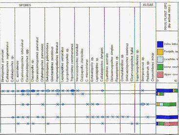
Example TPG Palynomorph Distribution Chart - portion of chart showing micofossils by semi-quantitative symbols and key palaeoenvironmental abundances
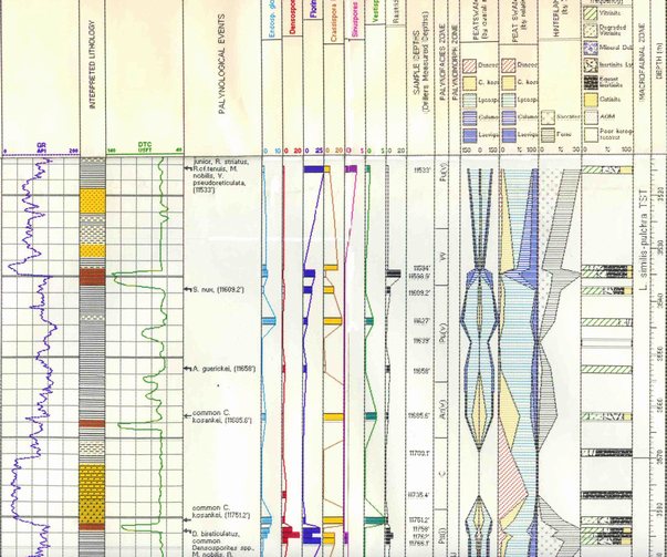
Example TPG Biofacies Summary Chart - with lithology, wireline, microfossil events, fully quantitative microfossil abundances, summary palynofacies & kerogen type percentage bar chart
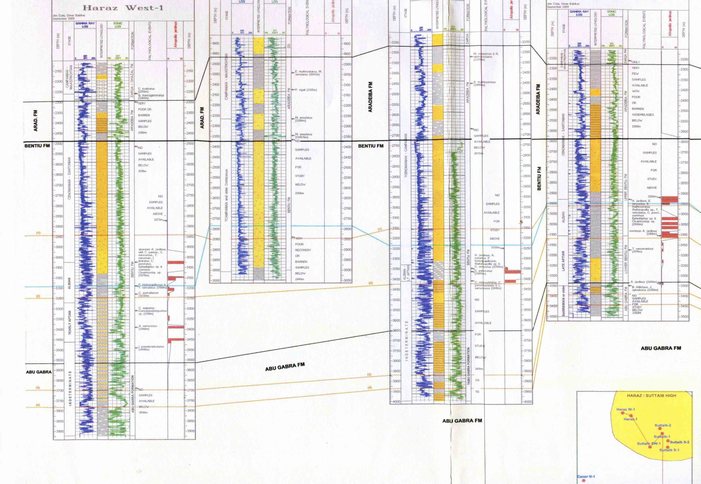
Example TPG Correlation Chart - showing a wireline log radical re-interpretation, guided by new biostratigraphical data